Graphic design and illustration
A collection of print and digital designs and illustrations that support storytelling, education, communications campaigns, and community connection.
Graphic design projects
Branding, digital, and print design projects for local organizations, personal projects, and communications campaigns.
Book cover design
Book cover redesigns just for fun.
Illustrations and one-off designs
One-off illustrations, designs, and other fun stuff. Commissions and just for fun.
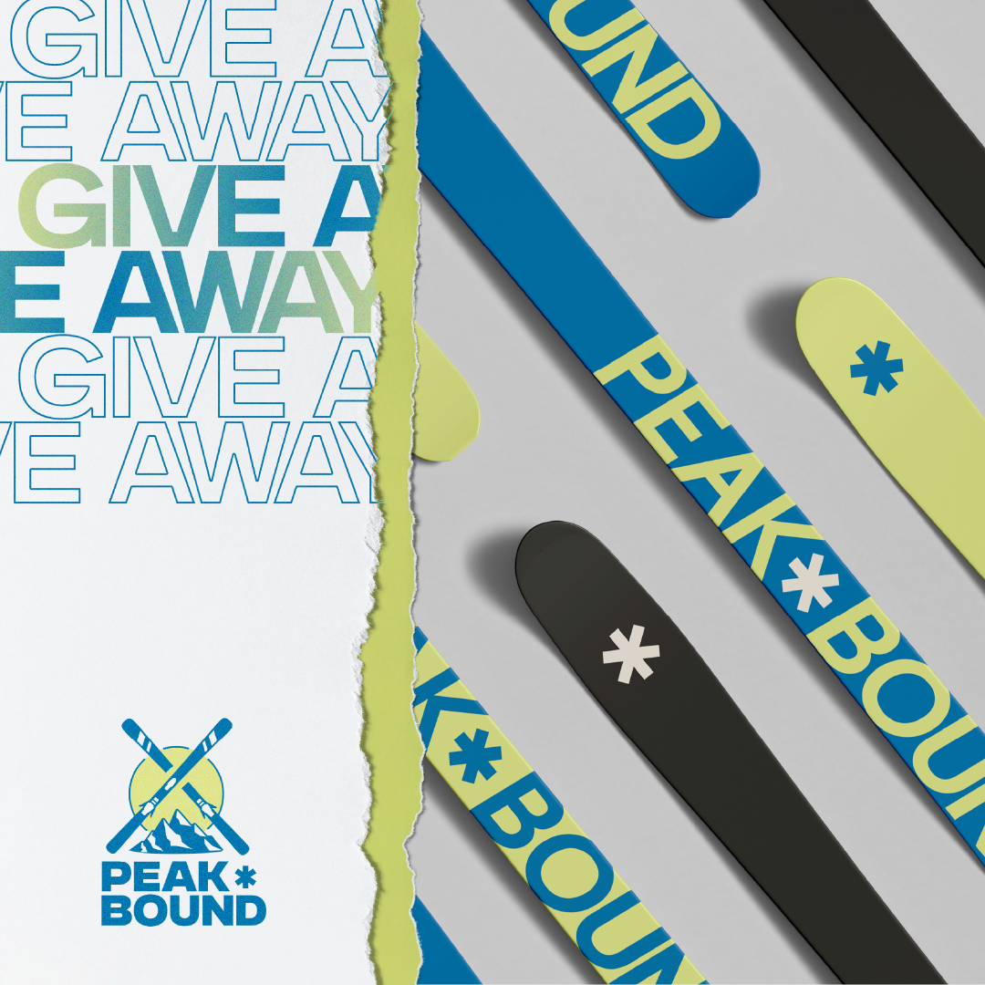
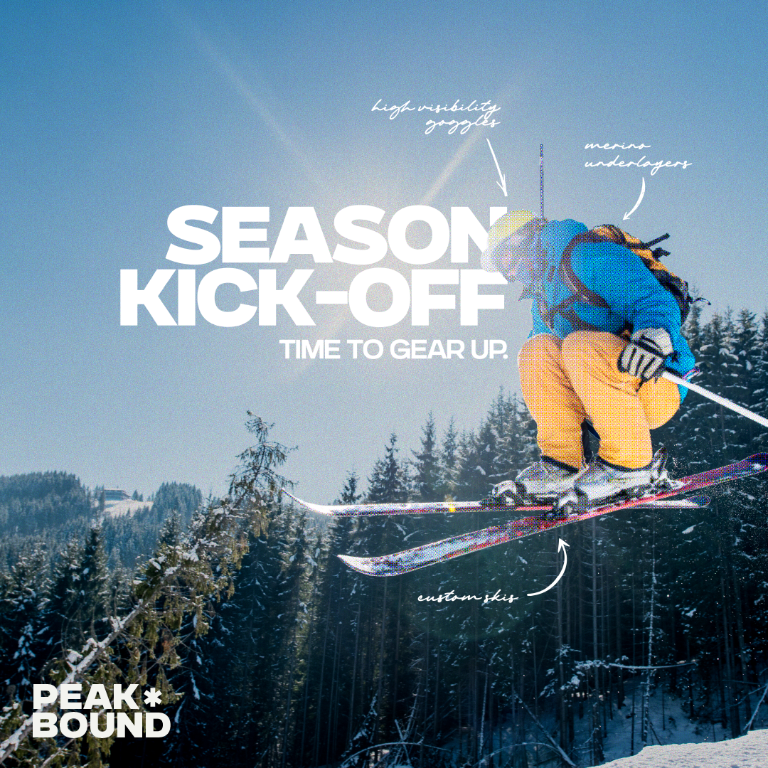
Peak Bound
Peak Bound is a conceptual branding project I created, catered to skiers and mountain enthusiasts.
The brand was created as a passion project to push my creative boundaries and explore logo design, visual identity, marketing collateral, and product mockups.
The brand was created as a passion project to push my creative boundaries and explore logo design, visual identity, marketing collateral, and product mockups.

Print
Social
Branding
Logo
Photoshop
Illustrator
Overview
Peak Bound is an outdoor gear and apparel company designed for thrill-seekers and mountain enthusiasts, providing high-quality products that inspire and equip skiers for their next adventure.
The brand emphasizes sustainability and style, highlighting the brand's adventure ethos and connecting emotionally with a community of like-minded adventurers and skiers.
The brand emphasizes sustainability and style, highlighting the brand's adventure ethos and connecting emotionally with a community of like-minded adventurers and skiers.
Tone and voice
Bold, adventurous, and energetic. Approachable yet confident, inspiring action and excitement for the outdoors.
Deliverables
Logo and branding that incorporates elements of mountains and skis; a vibrant colour palette inspired by alpine landscapes and bold typography for an energetic tone; social media graphics and product mockups.


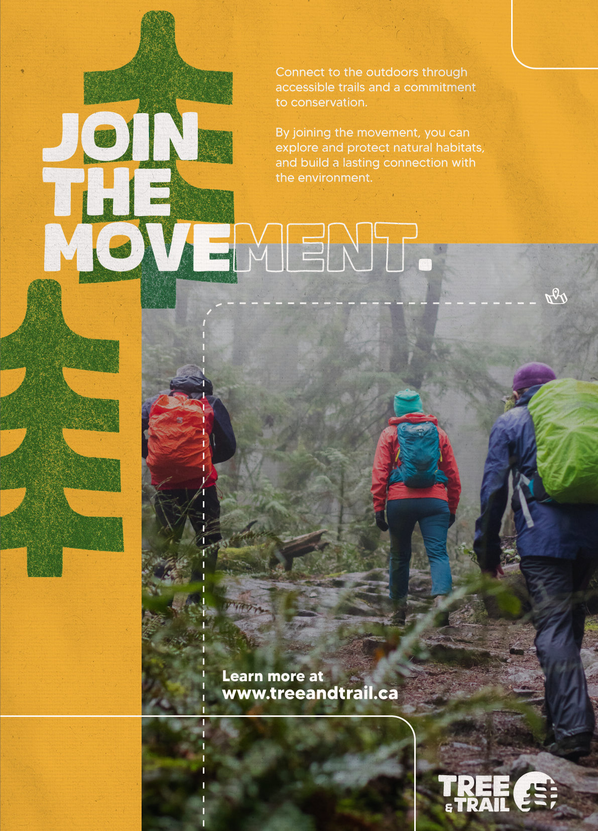
Tree & Trail
Tree & Trail is a conceptual brand project I came up with to inspire a connection to nature and Canada's beautiful trails and landscapes while practicing design and branding.
This project involved creating a brand identity and multiple print and digital deliverables for a marketing campaign.
This project involved creating a brand identity and multiple print and digital deliverables for a marketing campaign.

Print
Social
Branding
Photoshop
Illustrator
Overview
Tree & Trail is dedicated to connecting people with nature through accessible trails and a commitment to conservation.
They provide well-maintained trail networks, educational programs, and community initiatives that inspire outdoor exploration while promoting environmental stewardship.
They provide well-maintained trail networks, educational programs, and community initiatives that inspire outdoor exploration while promoting environmental stewardship.
Objective
To develop a cohesive and impactful brand identity that reflects Tree & Trail’s mission to inspire exploration while promoting conservation.
The identity should be approachable and engaging, resonating with outdoor enthusiasts of all experience levels.
The identity should be approachable and engaging, resonating with outdoor enthusiasts of all experience levels.
Tone and voice
Encouraging, adventurous, playful, and eco-conscious.
Deliverables
A recognizable primary and secondary logo inspired by trail markers and natural landscapes; marketing materials including posters, brochures, and social media assets for the Join the Movement campaign; a visual system with warm earthy tones and organic design elements; trail signage that blends functionality with the brand's visual identity.


Element Three
Element Three is a career coaching company focused on guiding people through meaningful career transitions.
The brand is built around the metaphor of growth through nature, drawing inspiration from natural forces like trees and plants to reflect a grounded, empowering coaching style.
The brand is built around the metaphor of growth through nature, drawing inspiration from natural forces like trees and plants to reflect a grounded, empowering coaching style.

Branding
Photoshop
Website design
Illustrator
UX writing
Objective
To develop a professional brand identity for a new coaching business, ensuring the visuals conveyed clarity, trust, and personal growth.
The goal was to create a clean, modern system that felt professional yet approachable.
The goal was to create a clean, modern system that felt professional yet approachable.
Tone and voice
Warm, insightful, confident. Rooted in nature, the tone encourages reflection and forward movement.
Deliverables
A complete brand identity including a custom wordmark and symbol-based logo inspired by natural elements and transformation. Supporting assets included brand guidelines, business cards, letterhead, and visual direction for the WordPress website.
The designs use earth tones and modern typography to create a digital experience that is both professional and nature-inspired.
The designs use earth tones and modern typography to create a digital experience that is both professional and nature-inspired.


City of Ottawa, OC Transpo
As part of my work with OC Transpo, I create a wide range of print and digital communications materials aimed at making transit information more accessible, engaging, and user-friendly.
These materials serve diverse audiences across Ottawa and are aligned with City branding and AODA/WCAG accessibility standards, supporting city-wide communications campaigns.
These materials serve diverse audiences across Ottawa and are aligned with City branding and AODA/WCAG accessibility standards, supporting city-wide communications campaigns.
Illustrator
Photoshop
Print design
Social media assets
UX writing
Overview
My work supports more than just transit. It helps advance the City of Ottawa’s mission to provide affordable, environmentally sustainable, and community-driven transportation.
Every design choice is guided by a commitment to equity, clarity, and public trust, strengthening my belief that design can and should serve the public good.
Every design choice is guided by a commitment to equity, clarity, and public trust, strengthening my belief that design can and should serve the public good.
Objective
To create accessible, high-impact designs and digital/print content that support city-wide communications campaigns and help tell compelling visual stories.
Each project is an opportunity to improve public engagement, simplify complex information, and deliver clear, inclusive messaging to diverse audiences across Ottawa.
Each project is an opportunity to improve public engagement, simplify complex information, and deliver clear, inclusive messaging to diverse audiences across Ottawa.
Tone and voice
Friendly, helpful, accessible. Designs prioritize clarity and readability, meeting riders where they are, whether online, at a station, or on a bus.
Deliverables
A variety of digital and print assets, including brochures, wayfinding posters, promo items like stickers, advertising assets, social media assets, web graphics, email headers, video and photo content, and more.
Each piece is designed with accessibility in mind, using high-contrast colours, legible fonts, and bilingual copy. All deliverables are informed by graphic design best practices and the City of Ottawa and OC Transpo's branding guides.
Each piece is designed with accessibility in mind, using high-contrast colours, legible fonts, and bilingual copy. All deliverables are informed by graphic design best practices and the City of Ottawa and OC Transpo's branding guides.


.png)


.png)
