Content and UX design
Each case study highlights how I simplify complex problems through user-focused research, writing, design, and testing.

OC Transpo website redesign
Designer, UX researcher, content stragetist
Adobe Illustrator, Figma, Expression Engine CMS
January 2024 to April 2024
Internal design, communications, and web teams
OC Transpo's internal style guide was inconsistent, hard to navigate, and lacked clear instructions on applying accessibility standards. This led to a fragmented user experience and outdated website content and design.
The web team felt overwhelmed by inconsistent components and unclear guides, in the same way customers felt overwhelmed when visiting the outdated site. I wanted to help simplify the experience for everyone.
- Revise the style guide to ensure that internal teams had an intuitive, easy-to-use resource that adhered to accessibility guidelines and ensured consistent, clear communication.
- Redesign web components to be more modern and better aligned with web content and design best practices.
- Audited the existing style guide and website and spotted gaps in content accessibility, such as poor contrast ratios and lack of clear guidelines for writing for the web.
- Led user interviews with the web team to uncover pain points, synthesizing data using empathy mapping.


- Simplified the guide's content, focusing on plain language and clear examples to help all teams implement design standards easily.
- A compromise here was condensing complex design principles into simplified pieces. While the SMEs wanted lots of details, I pushed for brevity and clarity to ensure content creators could quickly apply the information without feeling overwhelmed.
- Designed clear instructions on content accessibility, such as best practices for writing alt text, optimizing contrast, and structuring content for screen readers.
- Designed the guide in Figma with a user-centred layout, using clear headings and bulleted examples.
- Designed visual examples and mockups, ensuring that both content and design elements worked together to make the guide practical and easy to reference.
- Updated the visual design to be consistent with OC Transpo’s digital presence, clearly outlining colour palettes and their uses.


- Worked with the web and design teams to implement the new style guide in Expression Engine, OC Transpo's CMS.
- Developed training materials to help teams apply the style guide correctly, ensuring consistency across digital and print content.
- Redesigned outdated homepage widgets to reflect the new visual style guide.


This case study reinforced my understanding of how content and visual design should support each other.
By simplifying technical language and making the guide more user-friendly, I was able to create a practical resource that teams could easily implement, improving both the consistency of visual elements and the accessibility of content.
The end result was a website that met today's web and content design standards, and a much happier web team!


March Break webpage content design
Content designer and web developer
Expression Engine CMS, HTML/CSS, MS Word, WAVE
March 2024
OC Transpo needed a digital guide to help families navigate Ottawa using transit during March Break. The information was complex, consisting of policies, promotions, safety regulations, and an overwhelming amount city-wide activities.
The information arrived from multiple internal departments in dense, formal formats. My challenge was to transform it into a user-first, bilingual friendly, accessible, and engaging digital experience.
My goal was to create a clear and engaging guide that:
- Encouraged the use of special promotions.
- Simplified transit for families during March Break.
- Aligned with OC Transpo's formal voice while adding warmth and energy for a family-friendly context.
- Met WCAG and AODA standards for accessibility.
- Delivered bilingual-friendly content.
- Created user personas and their journey maps to break down the experience of a parent planning a March Break outing.
- Identified key questions at each stage of the journey.
- Solved the problem of overwhelming, dense content by dividing the guide into three clear sections.
- Advocated for readers by structuring content based on their actual planning process, not departmental priorities.


- Researched and collaborated with SMEs to ensure information was accurate and up to date.
- Translated dense policy language into plain, scannable copy for families.
- Problem solved with SMEs who preferred long and formal phrasing by proposing compromises like keeping the main page simple and linking to policy docs.
- Explained my reasoning using designer Sarah Winters' technique of asking: "What does the user need to do with this?" to refocus discussions.
- Collaborated with translators to preserve the tone across French and English.
- Shifted OC Transpo's formal voice to something more family-friendly while maintaining credibility.
- Used clear and direct headings to reduce effort for busy parents.
- Focused on accessibility with readability in mind: writing with a grade 6 to 8 reading level, testing contrast and headings using WAVE and internal guides, and ensuring text, alt text and structure met WCAG 2.1.


- Worked with the CMS layout while also building custom HTML/CSS.
- Implemented collapsible accordion sections to reduce scroll and cognitive load.
- Advocated for the inclusion of a fun, visual transit map to support the content.


I led this project from discovery through content and visual design and finally to launch. I pitched the idea as a way to boost traffic on our website as well as ridership over March Break.
Page views and time spent on page was drastically higher than our average KPIs for news items and web articles. The guide became a model for future content, and was reused for the March Break 2025 page.
This was a fun and rewarding project, and seeing families getting out on transit throughout the week to connect with their families and their city, and knowing I had a role to play in that, made all the work feel so worth it.

Element Three website and branding
Visit Element Three's full website.
Designer, content strategist, UX researcher
WordPress, Adobe Illustrator, Figma, Adobe Photoshop, MS Word, custom HTML/CSS, WAVE
April to May 2025
Element Three needed a brand identity and an accessible website. The brand had no existing assets or clear vision, so it was up to me to create an identity from scratch.
Create a clear, professional brand and website that resonates with a diverse audience, explains coaching values in plain language, and reflects the client's mission of growth and authenticity.
- Conducted interviews with the client to define brand tone, values, and target audiences.
- Created user personas and mapped their journeys to identify content needs.
- Structured content around what users need to know and natural next steps at each stage.


- Wrote all copy using plain language, front-loaded headings, and short paragraphs to support scanning.
- Prioritized clarity over excessive detail, balancing user needs with the SME's expectations.
- Used Sarah Winters' and Meghan Casey's methods to guide tone, structure, and voice.
- Designed a visual identity from scratch, including a logo, colour palette, typography, and brand guide.
- Used natural metaphors (trees, leaves, sunlight) to support the brand's message of growth.
- Created website layouts that balanced professionalism and warmth.


- Built the website in WordPress, tailoring the design with custom CSS.
- Ensured responsive design and accessibility across all devices and browsers.
- Checked content agaisnt WCAG and AODA standards using WAVE.


This project was a great opportunity to lead an end-to-end content and web design process. I collaborated with the client and balanced his needs while advocating for plain language and accessibility, ensuring all visual and written content supported the end user's needs.
The final product aligned content strategy, UX, branding, graphic design, and web development.
What an amazing journey!

Trail Wise app design
UX designer, researcher, content strategist
Figma, Miro, InVision
January 2024 to April 2024
Outdoor enthusiasts (myself included) were frustrated by the lack of a centralized tool to find trail and safety information while out on hiking trails. Current resources were fragmented and not optimized for mobile, making it hard for users to access real-time updates while hiking, without distracting from the nature around them.
Design a mobile-first app that consolidates trail data, safety information, and interactive features into one easy-to-use platform. The design needed to be visually engaging, accessible, and optimized for users in outdoor environments.
No one wants to be distracted on their phone during a hike, so we needed to design an app that would resolve user frustrations without taking away from their hiking experience.
- Conducted interviews and surveys to understand user pain points, such as fragmented information and difficulty navigating through multiple apps.
- Developed user personas and mapped their journeys to identify key touch-points in the app. We created a map that defined key actions and organized content in a logical flow that supported user needs.


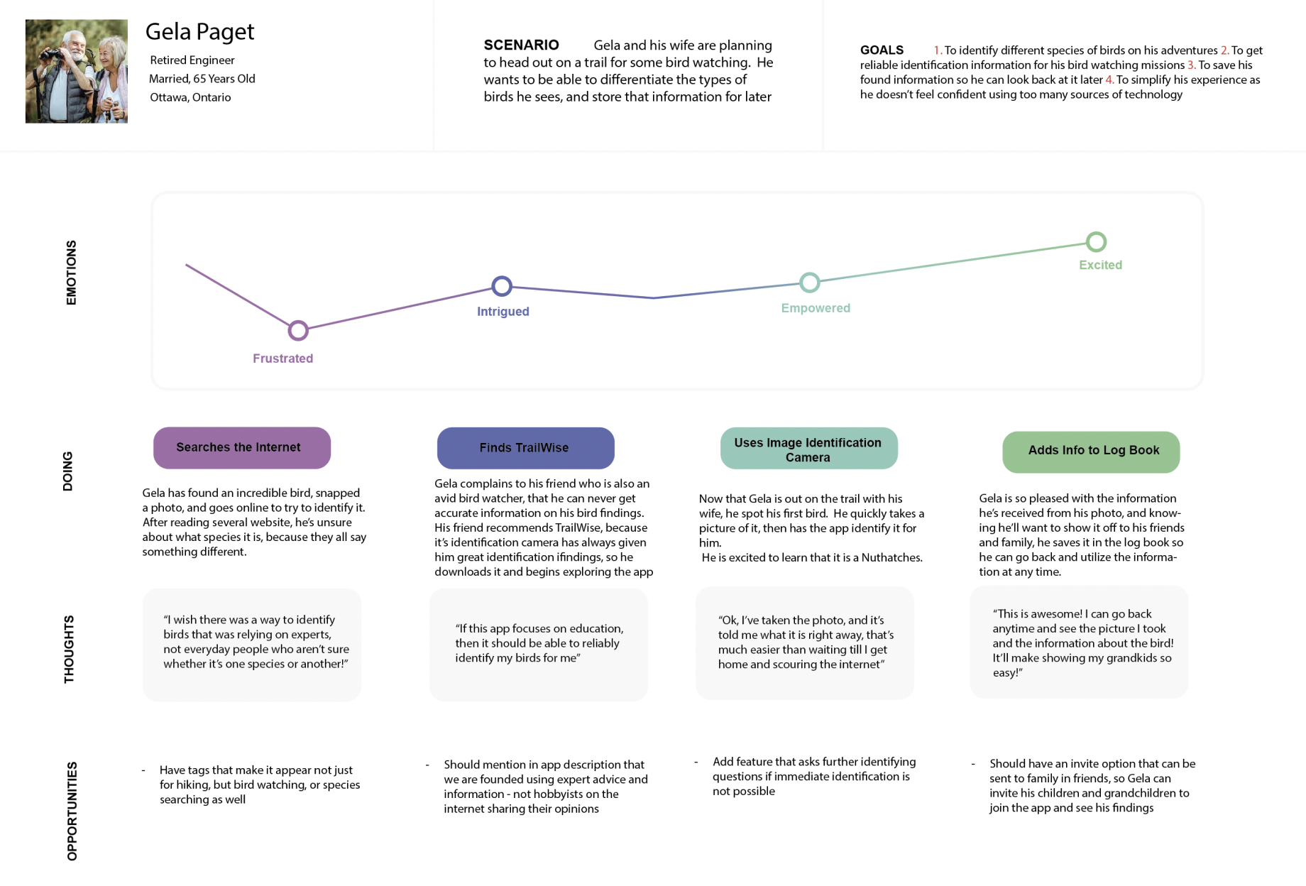

- Developed content that was concise and actionable, focused on providing users with information they needed in the least amount of time.
- The content was structured to lead the user through their journey, with key information (e.g. trail maps, safety tips).
- The compromise was balancing detailed safety information with the app’s mobile-first design. While some users wanted in-depth data on main pages, I focused on providing high-level details with the option to dive deeper if desired.
- In addition to content strategy, we focused on the visual design of the app, ensuring it was both functional and aesthetically appealing.
- Designed interactive wireframes in Figma, focusing on ease of navigation.
- Designed the app layout to prioritize essential information without overwhelming the user. The visual hierarchy was key: important trail info and emergency features were made easily accessible.
- Focused on creating an app layout that was visually engaging but still user-friendly for people in outdoor environments, where distractions could affect usability.


- Conducted usability testing to identify pain points in the user journey. Based on user feedback, we iterated on the content and layout, focusing on areas where users felt lost or confused.
- We focused on how users understood and navigated the app: was the content intuitive? Could they quickly find key info?


This project highlighted the importance of combining visual design with content strategy to create a user-friendly, engaging experience.
By focusing on intuitive design, we ensured the app’s content was easy to understand and interact with, regardless of the user’s experience level.
Stay in the loop. Follow along on social media.
.png)
.png)